The Colors page covers color blindness, which is the best-known accessibility issue in visualization, but not the only one. Around 8% of men can’t rely on your color choices; a further share of your readers use screen readers, have low vision, or read your figure on a phone in sunlight. Accessible design usually makes figures better for everyone.
Redundant encoding: never rely on color alone
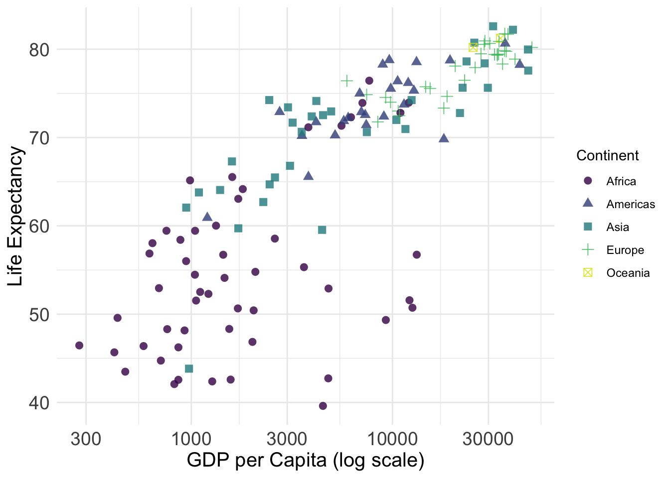
The single most effective habit. If groups differ by color, make them differ by something else too, like linetype, shape, direct labels, or facets. You have seen the linetype version on the Data Visualization page; shapes work the same way:
Because color and shape map to the same variable, ggplot2 merges them into one legend. Direct labeling (see Annotation & Storytelling) is even better because it removes the color-matching task entirely.
Contrast
Light grey text on white backgrounds fails for low-vision readers and for anyone viewing a projector in a bright room. The WCAG guideline is a contrast ratio of at least 4.5:1 for text check pairs at WebAIM’s contrast checker. Practical implications: avoid grey70 or lighter for anything carrying information; avoid pale yellow on white entirely; and remember beamer projectors wash out everything by a stop or two.
Text size
Most figures in slides and papers have text that is too small. Minimums that work in practice: 12 pt equivalent in papers, and for slides, whatever you can read from three meters behind your laptop. Setting theme_minimal(base_size = 14) (or higher for slides) scales all theme text at once.
Alt text: making figures visible to screen readers
A screen reader cannot see your plot; it reads the alternative text aloud. In Quarto, add it to any chunk:
```{r}#| fig-alt: >#| Scatterplot of GDP per capita against life expectancy for 142#| countries in 2007. Life expectancy rises steeply with income among#| poor countries and flattens out above roughly 10,000 dollars.```
Good alt text states the chart type, the variables, and the finding, in one to three sentences. “Figure 1” or “scatterplot” is not alt text. This matters beyond screen readers: alt text is what remains when images fail to load, and writing it is a useful discipline. If you cannot state the finding in two sentences, the figure may not have one.
A practical checklist
Run colorblindr::cvd_grid() on any color-dependent figure (see the Colors page).
Color never carries information alone: add shape, linetype, labels, or facets.
Text at least 12 pt equivalent; larger for slides.
Information-carrying elements at 4.5:1 contrast or better.
Every figure in HTML output has meaningful fig-alt.
Print the figure in greyscale. Still readable? Then colorblind readers, bad projectors, and photocopied readings are all covered.