Code
library(ggplot2)
library(dplyr)
library(gapminder)

gap2007 <- gapminder %>% filter(year == 2007)The difference between an exploratory plot and a publication plot is the annotation. A well-annotated graph answers the reader’s questions on the graph itself: What am I looking at? Which point matters? What happened here? Tufte’s principle applies: write the labelling directly on the graph.
library(ggplot2)
library(dplyr)
library(gapminder)
gap2007 <- gapminder %>% filter(year == 2007)Legends force the reader’s eye to travel back and forth. Where possible, label the data directly.
library(ggrepel)

# Label only a meaningful subset — labelling everything is labelling nothing
highlight <- gap2007 %>%
  filter(country %in% c("Norway", "Germany", "China", "India",
                        "Nigeria", "Haiti", "Afghanistan"))

ggplot(gap2007, aes(x = gdpPercap, y = lifeExp)) +
  geom_point(alpha = 0.3, color = "grey50") +
  geom_point(data = highlight, color = "darkred", size = 2.5) +
  geom_text_repel(data = highlight, aes(label = country), size = 4) +
  scale_x_log10() +
  labs(x = "GDP per Capita (log scale)", y = "Life Expectancy") +
  theme_classic() +
  theme(axis.text = element_text(size = 14),
        axis.title = element_text(size = 15))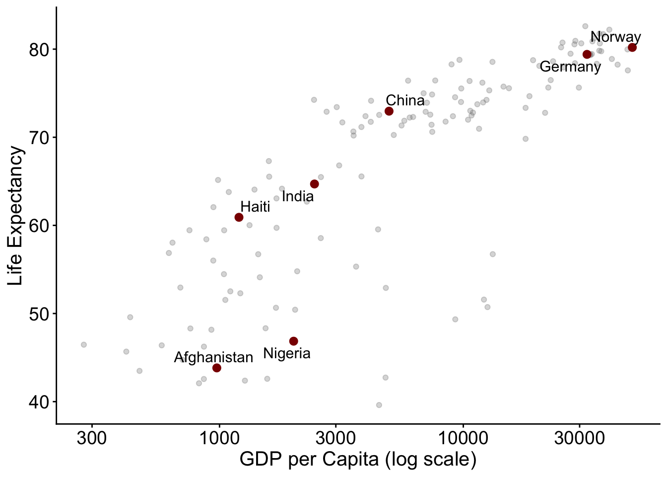
geom_text_repel() (from the ggrepel package) automatically moves labels so they don’t overlap points or each other. Plain geom_text() will happily print labels on top of your data.
Ending line charts with the series name replaces the legend entirely:
d <- gapminder %>% filter(country %in% c("Germany", "India", "China"))

ggplot(d, aes(x = year, y = lifeExp, color = country)) +
  geom_line(linewidth = 1.1) +
  geom_text_repel(
    data = d %>% group_by(country) %>% filter(year == max(year)),
    aes(label = country),
    direction = "y", hjust = 0, nudge_x = 1, size = 4.5
  ) +
  scale_color_viridis_d(option = "B", end = 0.85, guide = "none") +
  scale_x_continuous(limits = c(1952, 2015)) +
  labs(x = NULL, y = "Life Expectancy") +
  theme_classic() +
  theme(axis.text = element_text(size = 14),
        axis.title = element_text(size = 15))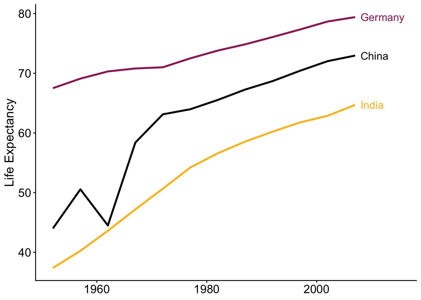
gghighlight greys out everything except what you want the reader to see. The “compared to what?” question answered visually.
library(gghighlight)

ggplot(gapminder, aes(x = year, y = lifeExp, group = country)) +
  geom_line(color = "darkred", linewidth = 1) +
  gghighlight(country %in% c("Rwanda", "Cambodia"),
              unhighlighted_params = list(color = "grey85", linewidth = 0.3)) +
  labs(x = NULL, y = "Life Expectancy",
       title = "Life expectancy collapses during mass violence",
       subtitle = "All other countries shown in grey") +
  theme_classic() +
  theme(axis.text = element_text(size = 14),
        axis.title = element_text(size = 15))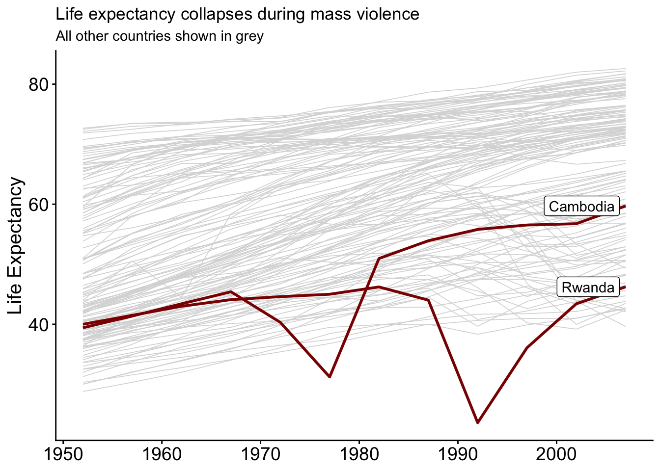
annotate() adds one-off text, arrows, and shading without needing a data frame. Use it to mark events, thresholds, and periods.
germany <- gapminder %>% filter(country == "Germany")

ggplot(germany, aes(x = year, y = lifeExp)) +
  annotate("rect", xmin = 1961, xmax = 1989, ymin = -Inf, ymax = Inf,
           alpha = 0.1, fill = "steelblue") +
  annotate("text", x = 1975, y = 78, label = "Berlin Wall era",
           color = "steelblue", size = 4.5) +
  geom_line(linewidth = 1.1) +
  geom_hline(yintercept = 75, linetype = "dashed", color = "grey40") +
  annotate("text", x = 1955, y = 75.7, label = "75 years",
           color = "grey40", hjust = 0, size = 4) +
  labs(x = NULL, y = "Life Expectancy") +
  theme_classic() +
  theme(axis.text = element_text(size = 14),
        axis.title = element_text(size = 15))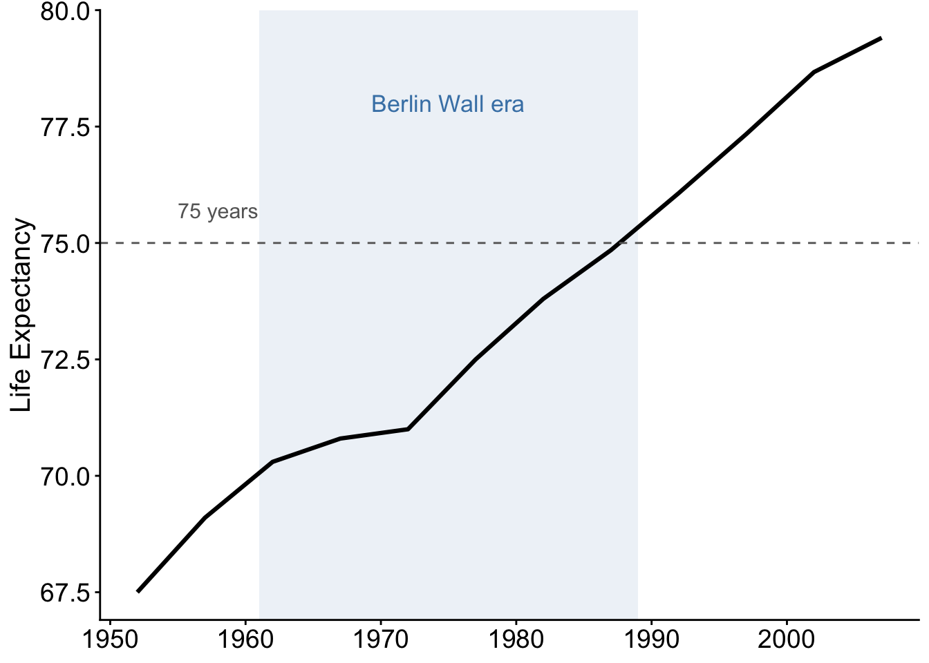
Compare “Life Expectancy by Continent” with “Africans live 15 years less than Europeans on average”. The first describes the axes; the second states the finding. Newspapers do this well; academic figures can too (use the caption if the title must stay neutral).
A useful division of labour:
labs(caption = "Data: Gapminder, 2007")).