Code
library(ggplot2)
library(dplyr)
library(gapminder)

gap2007 <- gapminder %>% filter(year == 2007)Every estimate you plot has uncertainty attached. Hiding it makes graphs look more precise than the analysis warrants; showing it badly makes graphs unreadable. Since much of social science communication consists of plotting model estimates, this deserves its own section.
library(ggplot2)
library(dplyr)
library(gapminder)
gap2007 <- gapminder %>% filter(year == 2007)You have seen coefficient plots with geom_errorbar() in the Applied Examples. Two rules:
cont_summary <- gap2007 %>%
  group_by(continent) %>%
  summarise(mean_le = mean(lifeExp),
            se = sd(lifeExp) / sqrt(n()))

ggplot(cont_summary, aes(x = reorder(continent, mean_le), y = mean_le)) +
  geom_point(size = 3) +
  geom_errorbar(aes(ymin = mean_le - 1.96 * se, ymax = mean_le + 1.96 * se),
                width = 0.15) +
  coord_flip() +
  labs(x = NULL, y = "Mean Life Expectancy",
       caption = "Error bars show 95% confidence intervals.") +
  theme_minimal() +
  theme(axis.text = element_text(size = 14),
        axis.title = element_text(size = 15))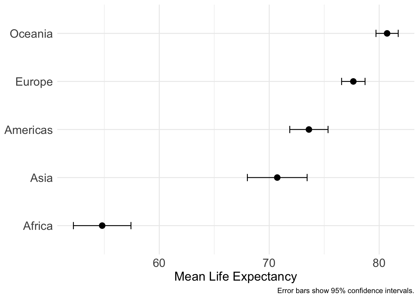
Do not put error bars on top of bar charts (“dynamite plots”). The bar’s length encodes the mean, but the filled area below carries no information and the interval below the mean is hidden. Use a point range instead, as above.
For predicted values across a continuous variable, use geom_ribbon(), you have seen this pattern with ggeffects:
ggplot(gap2007, aes(x = gdpPercap, y = lifeExp)) +
  geom_point(alpha = 0.25) +
  geom_smooth(method = "loess", se = TRUE, alpha = 0.3) +
  scale_x_log10() +
  labs(x = "GDP per Capita (log scale)", y = "Life Expectancy",
       caption = "Shaded band: 95% confidence interval of the LOESS fit.") +
  theme_minimal() +
  theme(axis.text = element_text(size = 14),
        axis.title = element_text(size = 15))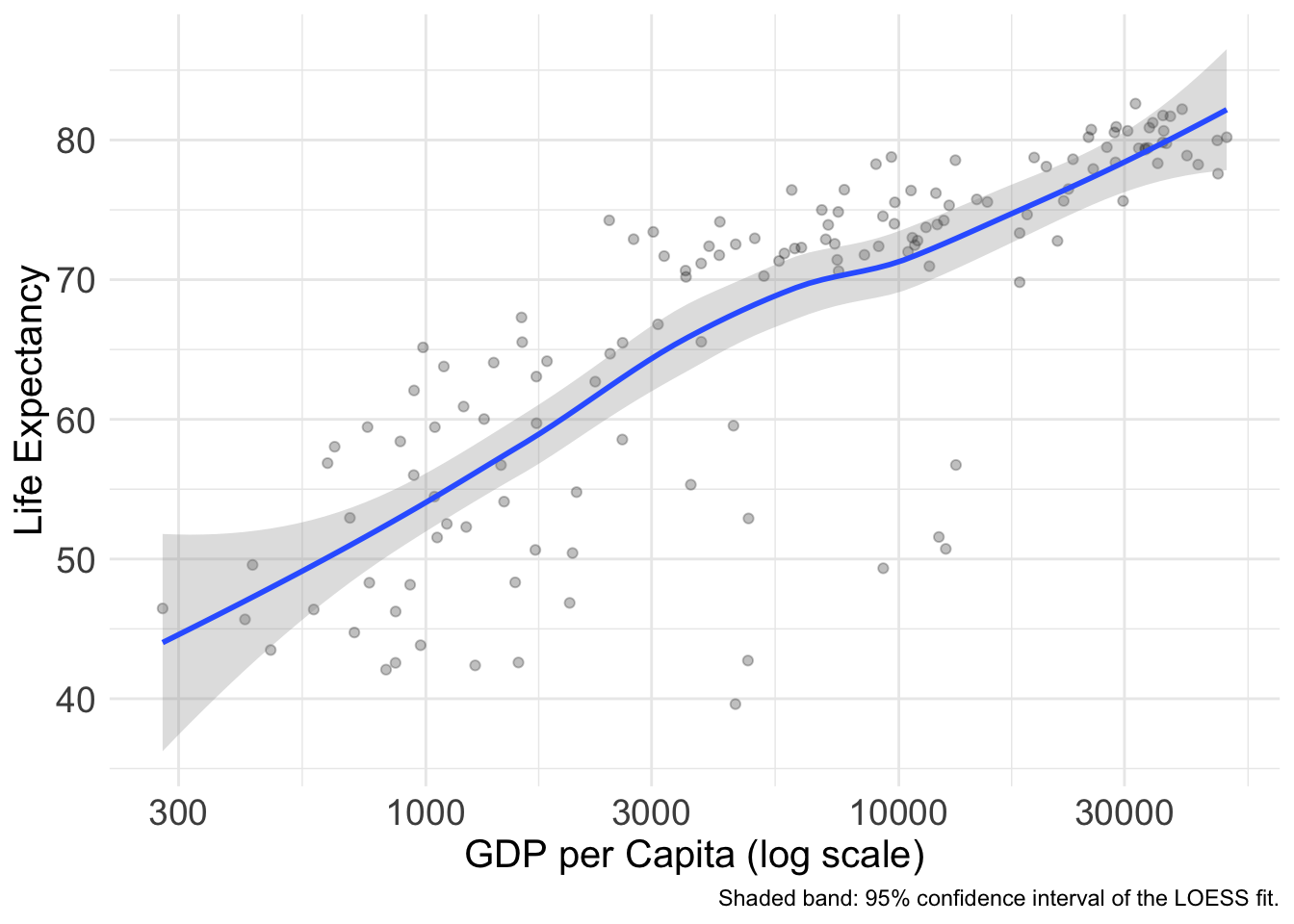
ggdistThe ggdist package provides geoms that show whole distributions of uncertainty instead of a single interval, half-eyes, gradient intervals, and quantile dotplots.
library(ggdist)

ggplot(gap2007, aes(x = lifeExp, y = continent)) +
  stat_halfeye(aes(fill = continent), alpha = 0.7,
               .width = c(0.66, 0.95)) +
  scale_fill_viridis_d(end = 0.95, guide = "none") +
  labs(x = "Life Expectancy", y = NULL,
       caption = "Points: medians. Bars: 66% and 95% intervals. Curves: distributions.") +
  theme_minimal() +
  theme(axis.text = element_text(size = 14),
        axis.title = element_text(size = 15))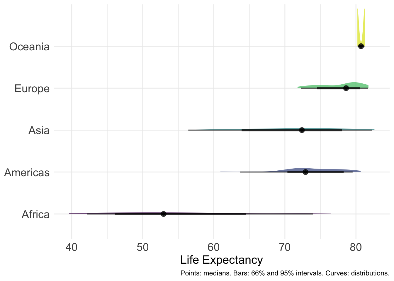
The gradient interval avoids the cliff-edge problem entirely, certainty fades out gradually:
ggplot(gap2007, aes(x = lifeExp, y = continent)) +
  stat_gradientinterval(aes(fill = continent)) +
  scale_fill_viridis_d(end = 0.95, guide = "none") +
  labs(x = "Life Expectancy", y = NULL) +
  theme_minimal() +
  theme(axis.text = element_text(size = 14),
        axis.title = element_text(size = 15))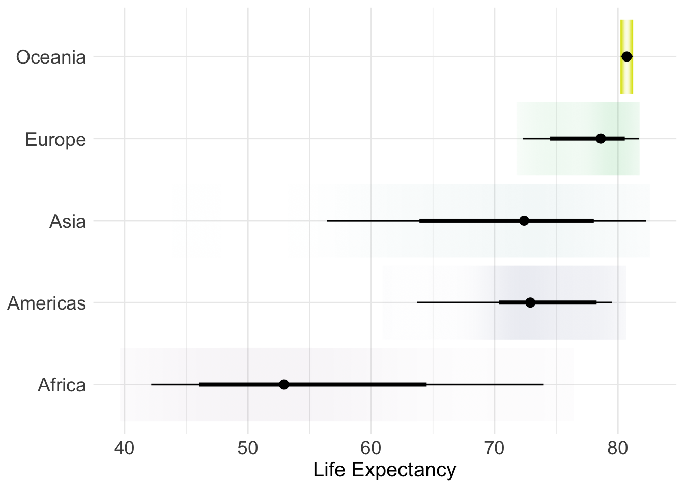
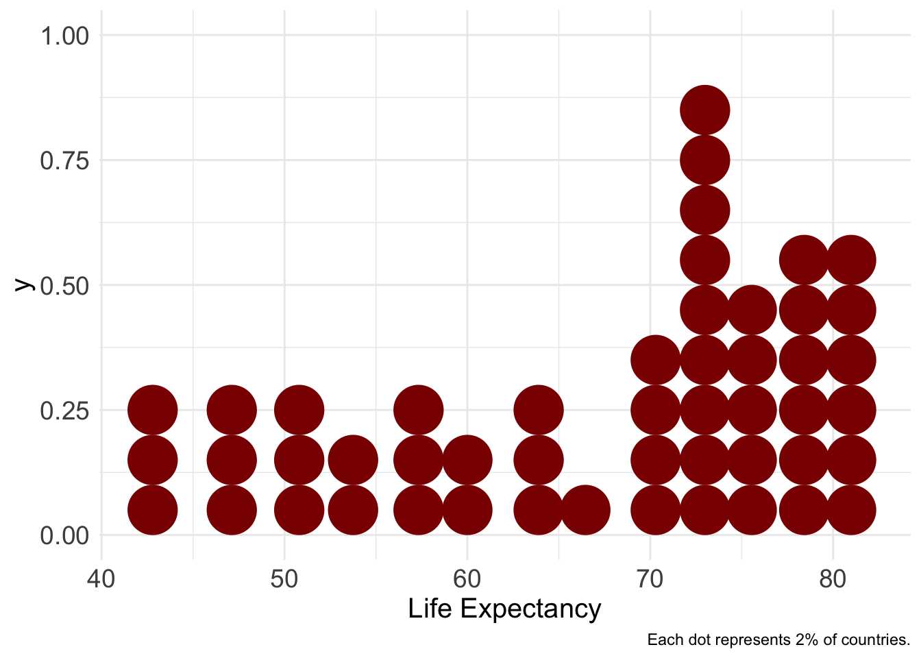
Quantile dotplots show uncertainty as a countable number of dots, lay audiences read frequencies (“18 of 20 dots are above 60”) far better than probability densities:
ggplot(gap2007, aes(x = lifeExp)) +
  stat_dots(quantiles = 50, fill = "darkred", color = NA) +
  labs(x = "Life Expectancy",
       caption = "Each dot represents 2% of countries.") +
  theme_minimal() +
  theme(axis.text = element_text(size = 14),
        axis.title = element_text(size = 15))