Code
library(ggplot2)
library(dplyr)
library(gapminder)
library(ggrepel)

gap2007 <- gapminder %>% filter(year == 2007)Try the exercises yourself before opening the folded code. These are possible solutions in visualization, though there is rarely a single correct answer, only better and worse justified choices.
library(ggplot2)
library(dplyr)
library(gapminder)
library(ggrepel)
gap2007 <- gapminder %>% filter(year == 2007)1.1 (b) Complementary highlight
gap2007 %>%
  mutate(group = ifelse(continent == "Europe", "Europe", "Other")) %>%
  ggplot(aes(x = gdpPercap, y = lifeExp, color = group)) +
  geom_point(size = 2.5, alpha = 0.8) +
  scale_x_log10() +
  scale_color_manual(values = c("Europe" = "#1f78b4", "Other" = "grey70")) +
  labs(x = "GDP per Capita (log scale)", y = "Life Expectancy", color = NULL) +
  theme_classic()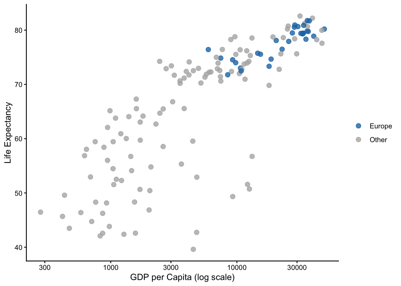
A highlight doesn’t need two saturated complementary colors. One saturated color against grey is usually stronger. If you did use orange/blue: those are complementary and colorblind-safe, which is why they are so common.
1.2 Under deuteranopia, red/green highlights fail. The fix without changing colors: add a redundant channel, e.g. aes(shape = group) or larger point size for the highlighted group.
1.3 Unemployment level is a sequential quantity (one direction, zero-bounded) → sequential scale (scale_fill_viridis_c()). Change in unemployment has a meaningful midpoint at zero → diverging scale (scale_fill_gradient2(midpoint = 0)). Qualitative palettes are only for unordered categories.
2.1
pop (log x-scale).lifeExp, color/linetype = continent (Africa, Europe only).gdpPercap (log scale).pop (log), y = lifeExp.2.3 Pie charts encode values as angles, which Cleveland & McGill showed are judged much less accurately than positions on a common scale. With 12 slices, ordering by eye is nearly impossible. Better: a sorted horizontal bar chart.
set.seed(1)
brands <- tibble(brand = LETTERS[1:12],
                 share = prop.table(runif(12)) * 100)

ggplot(brands, aes(x = reorder(brand, share), y = share)) +
  geom_col(fill = "steelblue") +
  coord_flip() +
  labs(x = NULL, y = "Market share (%)") +
  theme_classic()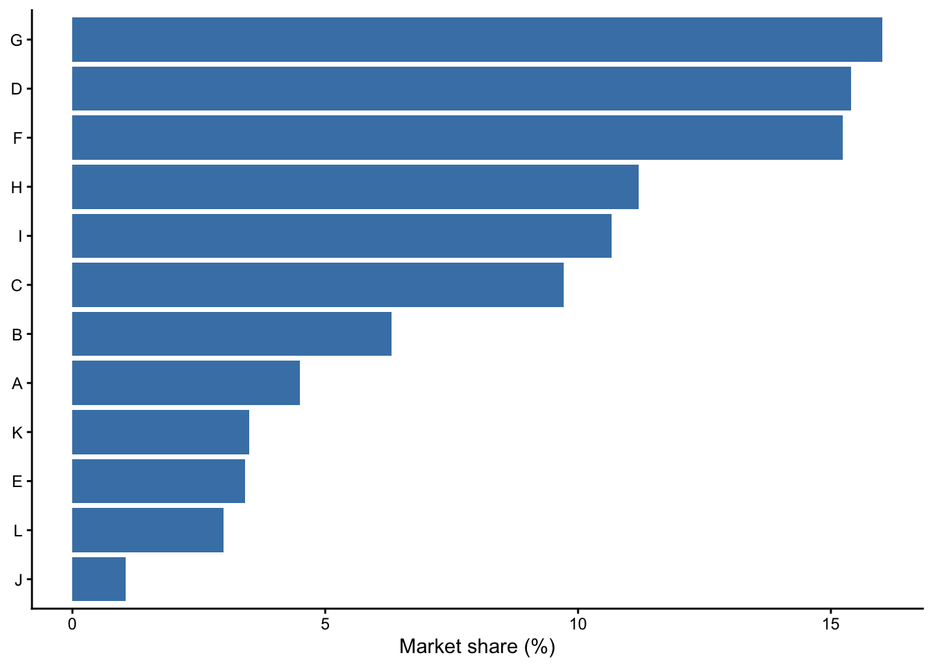
3.1
ggplot(gap2007, aes(x = gdpPercap)) +
  geom_histogram(bins = 30, fill = "darkred") +
  scale_x_log10() +
  labs(x = "GDP per Capita (log scale)") +
  theme_classic()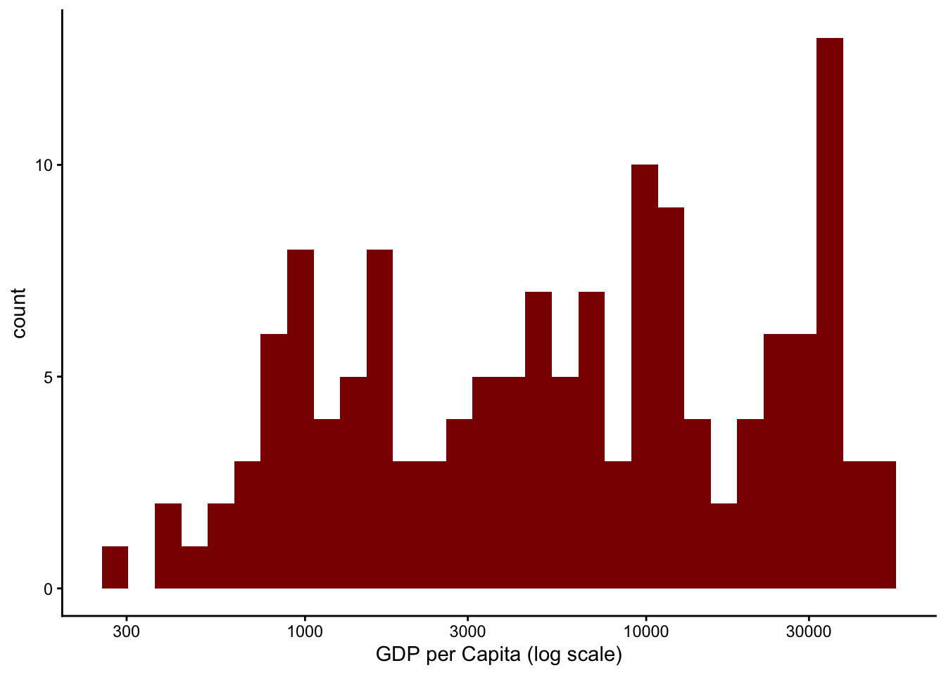
Caveat for the reader: on a log axis, equal distances mean equal ratios, not equal differences. The visual symmetry is a property of the transformed scale.
3.2
top5 <- gap2007 %>% slice_max(pop, n = 5) %>% pull(country)

d <- gapminder %>% filter(country %in% top5)

ggplot(d, aes(x = year, y = pop, color = country)) +
  geom_line(linewidth = 1.1) +
  geom_text_repel(
    data = d %>% group_by(country) %>% filter(year == max(year)),
    aes(label = country), direction = "y", hjust = 0, nudge_x = 1, size = 4
  ) +
  scale_color_viridis_d(end = 0.9, guide = "none") +
  scale_x_continuous(limits = c(1952, 2020)) +
  scale_y_continuous(labels = scales::label_number(scale = 1e-9, suffix = "B")) +
  labs(x = NULL, y = "Population") +
  theme_classic()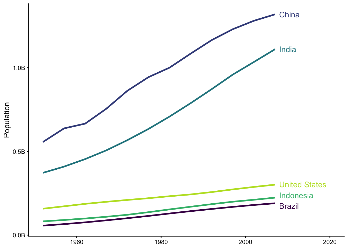
3.3
cont_year <- gapminder %>%
  group_by(continent, year) %>%
  summarise(lifeExp = mean(lifeExp), .groups = "drop")

ggplot(cont_year, aes(x = year, y = lifeExp, color = continent)) +
  geom_line(linewidth = 1.1) +
  scale_color_viridis_d(end = 0.95) +
  annotate("text", x = 1997, y = 51, label = "African progress stalls\nin the 1990s (HIV/AIDS)",
           hjust = 1, size = 3.5, color = "grey30") +
  annotate("curve", x = 1997, xend = 2000, y = 52.5, yend = 53.8,
           curvature = 0.3, arrow = arrow(length = unit(2, "mm")), color = "grey30") +
  labs(x = NULL, y = "Mean Life Expectancy", color = "Continent") +
  theme_classic()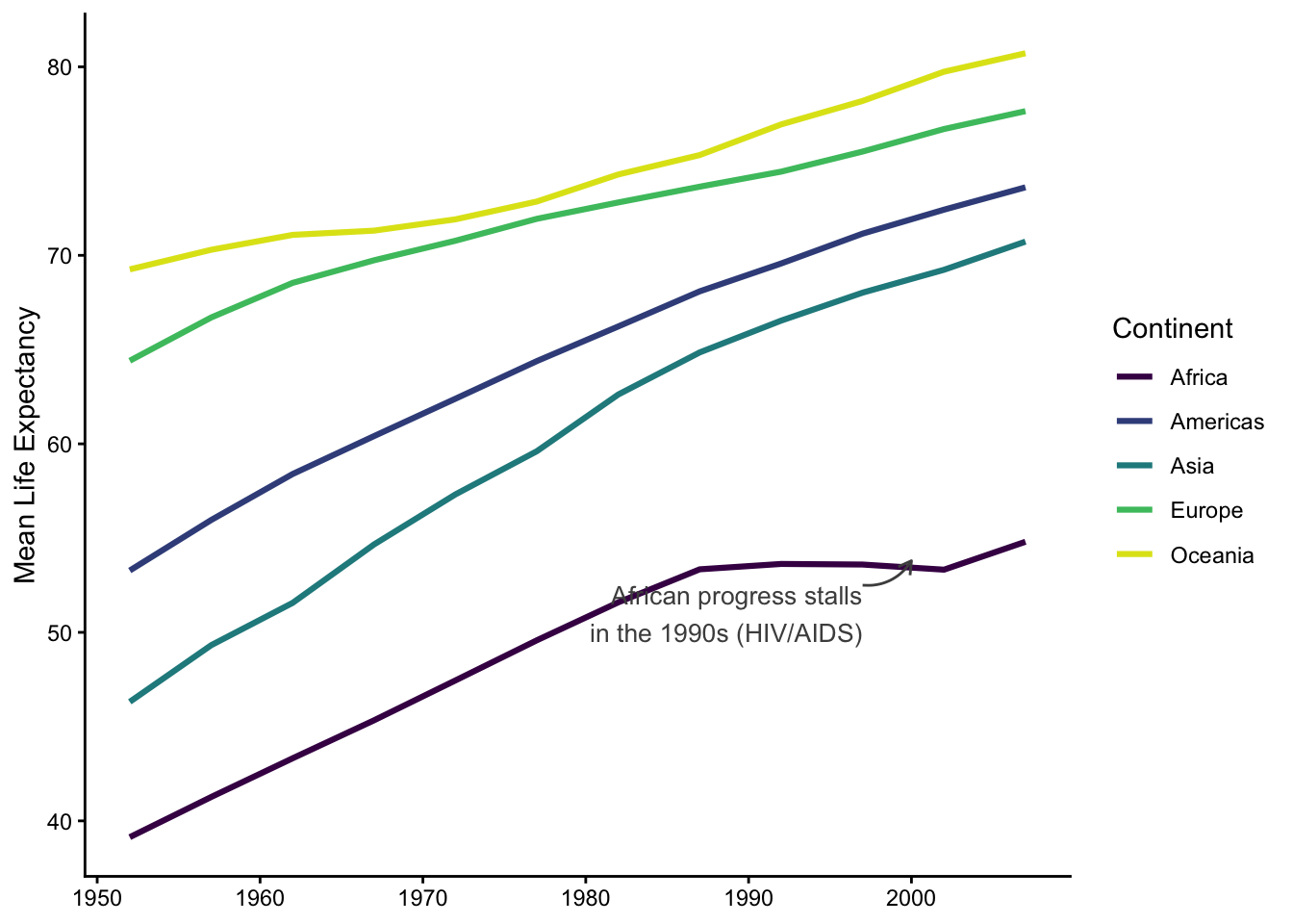
labels <- gap2007 %>%
  filter(country %in% c("China", "India", "United States", "Nigeria", "Norway"))

ggplot(gap2007, aes(x = gdpPercap, y = lifeExp, size = pop, color = continent)) +
  geom_point(alpha = 0.7) +
  geom_text_repel(data = labels,
                  aes(x = gdpPercap, y = lifeExp, label = country),
                  size = 4, color = "black", inherit.aes = FALSE) +
  scale_x_log10() +
  scale_size(range = c(2, 20), guide = "none") +
  scale_color_viridis_d(option = "D", end = 0.95) +
  labs(
    title = "Richer countries live longer, but population size plays no role",
    subtitle = "142 countries, 2007. Bubble size = population.",
    caption = "Data: Gapminder",
    x = "GDP per Capita (log scale)", y = "Life Expectancy", color = "Continent"
  ) +
  theme_minimal()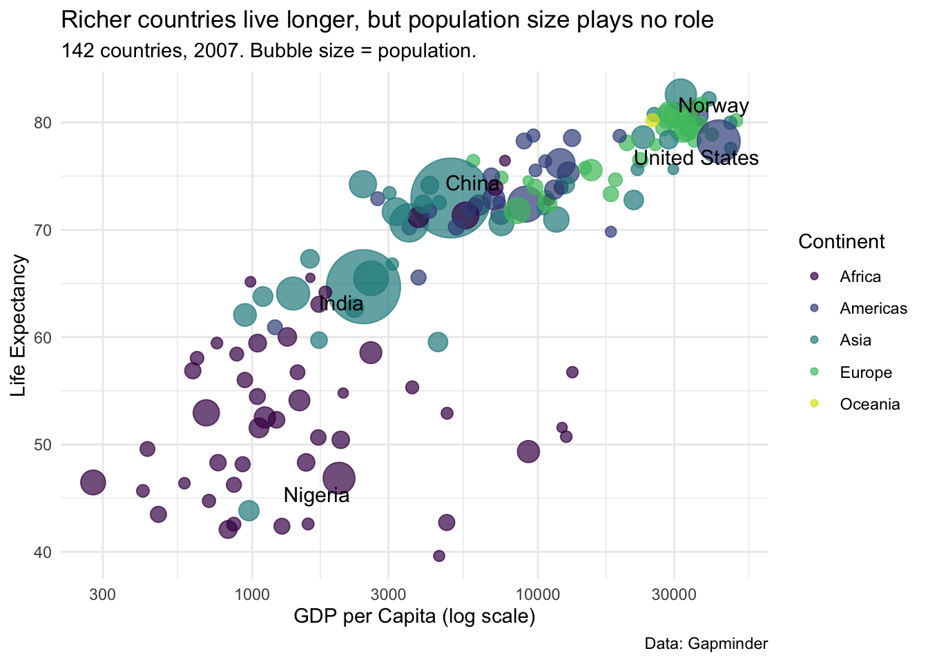
The substantive point most students find: income predicts life expectancy strongly (with diminishing returns, hence the log scale), while population size is essentially unrelated to it.
4.1 Problems: unordered x-axis, unreadable overlapping labels, redundant color legend (country is already on the axis), heavy outlines, purple gridlines and yellow background (chartjunk), uninformative axis titles, unformatted y-axis numbers.
gap2007 %>%
  slice_max(pop, n = 10) %>%
  ggplot(aes(x = reorder(country, pop), y = pop)) +
  geom_col(fill = "steelblue") +
  coord_flip() +
  scale_y_continuous(labels = scales::label_number(scale = 1e-6, suffix = "M")) +
  labs(title = "Top 10 Most Populous Countries (2007)",
       x = NULL, y = "Population (millions)", caption = "Data: Gapminder") +
  theme_classic()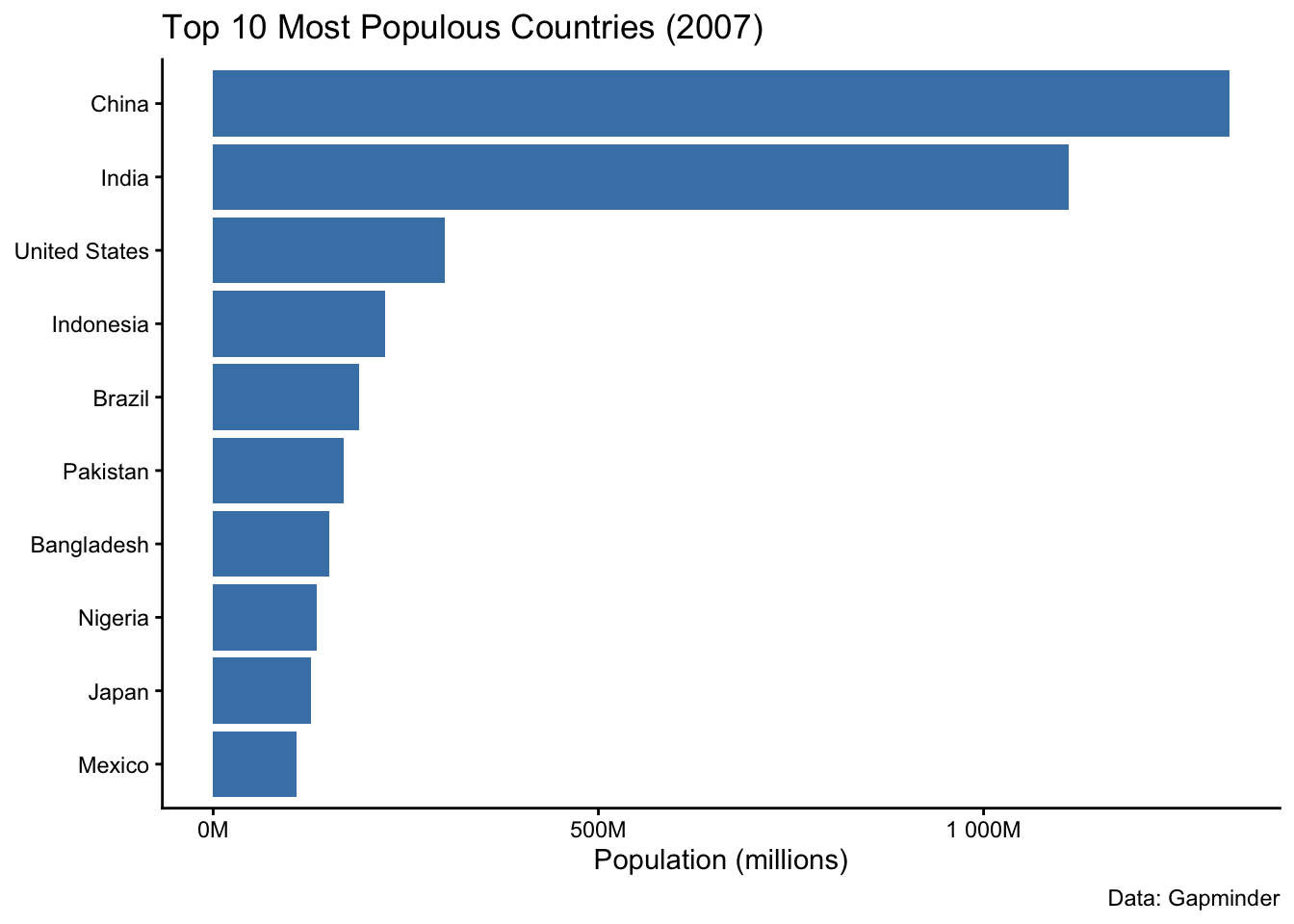
4.2 The bar’s area below the mean carries no information but dominates the plot; bars imply the y-axis starts at zero and hide the distribution. A point range over the raw data shows more with less ink:
cont_summary <- gap2007 %>%
  group_by(continent) %>%
  summarise(m = mean(lifeExp), se = sd(lifeExp) / sqrt(n()))

ggplot(gap2007, aes(x = continent, y = lifeExp)) +
  geom_jitter(width = 0.15, alpha = 0.3, color = "grey50") +
  geom_pointrange(data = cont_summary,
                  aes(y = m, ymin = m - 1.96 * se, ymax = m + 1.96 * se),
                  color = "darkred", linewidth = 1) +
  labs(x = NULL, y = "Life Expectancy",
       caption = "Red: means with 95% CI. Grey: individual countries.") +
  theme_classic()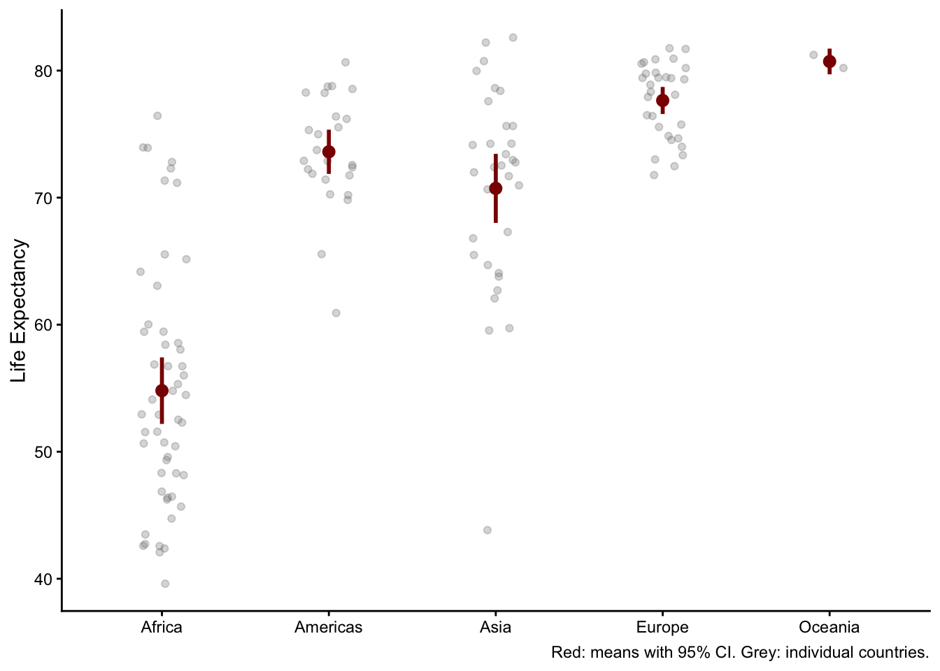
4.3 Truncating a bar chart’s axis breaks the proportionality between bar length and value (Tufte’s first principle) a 2-point difference can look like a 3-fold one. For line charts, the position encoding is the line’s vertical location, not a length from zero, so a non-zero axis is often fine and sometimes necessary but mark it clearly.
5.1 With a linear fill, China and India consume the entire scale and every other country looks identical. Log-transform the fill: scale_fill_viridis_c(trans = "log10", labels = scales::label_number(scale_cut = scales::cut_short_scale())).